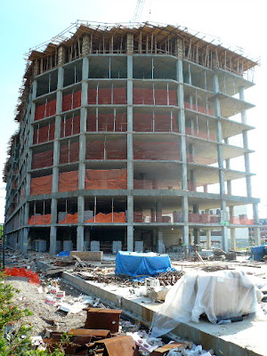
metroneverstops getting taller
Metrostop just keeps getting taller! Eight floors down, two to go. The first two floors are parking and retail, and so far six residential floors have been built on top. Also, work has begun on segmenting the first floor with cinder blocks, creating individual entranceways, and what I can only presume to be retail areas for the restaurant and coffee shop:
The two story ramp is quite a statement, I wonder if it will be visible when the project is finished? Here are two pictures of the ramp. It looks like residents will park on the second floor if they purchase a parking spot:
Here's a shot looking south along Jackson Street:
Below is a sampling of random home made signs dotted throughout the construction site - they may be talented workers and craftsman, but put some paint in their hands and it's hello 3rd grade art class all over again:
One sign that looks pretty snazzy is the photographed signage for Amelia's Bistro, the soon to be yummy Italian bistro that will be housed inside Metrostop. Coincidentally, it is the only marketing signage lining the chain link fences that all of a sudden is covered in flowers?! Double coincidentally, my mother-in-law's first name happens to be Amelia. However we are NOT owners or proprietors of Amelia's Bistro, nor are we even silent financial backers. So all of you anonymous comment posters can rest easy. Down boys.
It does however seem like fate that Amelia's Bistro will soon be our new neighbor. And when the in-laws visit I'm sure we will become regulars at the bar ordering martinis.
Here's a cool shot of the rounded south end of the building:
It's set back quite substantially from the street, providing much needed open space. Perhaps, god willing, there may be outdoor dining in our future? Or maybe this is where the sculpture garden will be? It does provide an open feel to the light rail entrance:
Random staircase to nowhere:
This view makes it quite clear how close to the light rail this building really is:
The heights of Metrostop, from the back of the building:
And lastly, the classic shot from 8th Street, providing much needed perspective. Looking good:


No comments:
Post a Comment